
Cart
0
A 30x40 cm print hits a sweet spot in home styling: large enough to feel intentional, small enough to move around easily, and flexible enough to work solo, as a pair, or in a clean grid. If you want a wall that looks “designed” rather than “random,” this size is one of the easiest building blocks to repeat.
Below you’ll find pairing formulas and grid layouts that work particularly well with 30x40 cm prints, plus practical measurements you can copy straight onto your tape measure before you start hanging.
Why 30x40 cm works so well on real walls
Most people struggle with wall art for one of two reasons: they choose something too small for the space, or they mix sizes without a clear structure.
30x40 cm avoids both problems.
- It scales up nicely in multiples (two, three, six) without looking busy.
- It’s easy to align (clean edges make tidy grids possible).
- It’s forgiving in rooms where you might re-arrange furniture (home offices, rentals, first flats).
It also sits close to the classic “medium” frame category, which makes it easy to integrate with other common poster sizes if you already own pieces.
Measure first: the three numbers that decide whether it looks polished
Before choosing a layout, decide these three measurements. They determine whether your 30x40 cm set will look cohesive.
1) Orientation (portrait or landscape)
A 30x40 cm print can be hung:
- Portrait: 30 cm wide by 40 cm high (feels taller, calmer, more architectural)
- Landscape: 40 cm wide by 30 cm high (feels wider, more social, great above furniture)
The biggest mistake with grids is mixing orientations without planning for it. If you want a crisp grid, keep the same orientation within each row.
2) Gap between frames
For most homes, a 5 to 8 cm gap between frames is the “looks intentional” zone.
- Smaller than 5 cm can feel cramped unless your frames are very thin.
- Larger than 8 cm can look disconnected (unless you’re working on a very large wall).
Pick one gap and repeat it everywhere. Consistent spacing is what makes grids feel premium.
3) Total outside size (print plus frame)
30x40 cm is the artwork size, but the visual footprint is usually larger once framed (especially if you add a mount). Because frame styles vary, the safest approach is:
- Measure one framed piece you own, or
- Decide your layout using print dimensions, then add extra allowance for the frame on all sides before you commit to wall placement.
Perfect pairing ideas for 30x40 cm prints
Pairing is about balance: you want each piece to feel like it belongs, without every frame fighting for attention.
The simplest win: a matching pair (diptych)
Two 30x40 cm prints side-by-side is the fastest way to make a wall look curated.
Where it works best:
- Above a small sofa or loveseat
- Over a console table
- In a bedroom above bedside tables (one print per side)
Design tip: pick a pairing strategy and stick to it, such as same colour palette, same subject, or one “busy” piece plus one calmer piece.
The “gallery but calm” approach: a triptych
Three 30x40 cm prints in a row creates rhythm without needing lots of different sizes.
This works particularly well when:
- Your wall is wide (behind a sofa, above a dining bench)
- You want impact but don’t want a full gallery wall
Pairing 30x40 cm with other sizes (without chaos)
If you’re mixing sizes, make 30x40 cm your “core size” and add one supporting size consistently (instead of mixing three or four).
Here are reliable pairings that tend to look balanced:
| 30x40 cm role | What to pair it with | Why it works | Best for |
|---|---|---|---|
| Main feature | Another 30x40 cm | Symmetry and clean alignment | Minimalist walls, tidy grids |
| Supporting set | One larger “anchor” print | Anchor sets hierarchy (big piece leads, 30x40 supports) | Living rooms, stair walls |
| Accent pieces | A smaller repeated size | Adds detail without breaking structure | Hallways, home offices |
If you already have existing frames at home, the key is not the exact centimetres. The key is repeating one rule, like “all frames are black” or “all art has warm neutrals.”

Grid ideas: ready-to-use layouts for 30x40 cm prints
Grids are popular because they remove uncertainty. The grid tells your eye “this is a set,” even if the artworks are varied.
Below are grid layouts that work especially well for 30x40 cm.
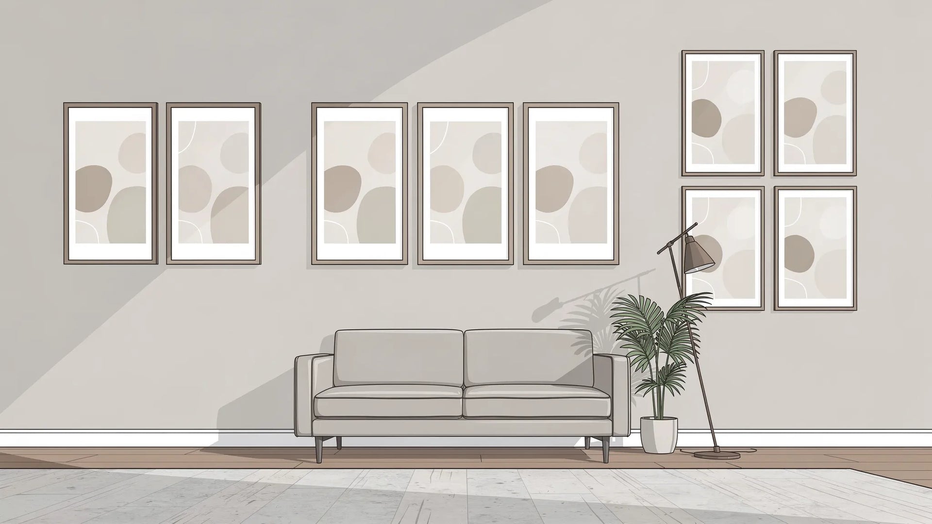
2x2 grid (4 prints): the most versatile grid
A 2x2 grid is a great first gallery-style layout because it fits many walls and still looks substantial.
Best placements:
- Above a medium sofa
- In a bedroom over a chest of drawers
- On a large hallway wall
If you keep the spacing consistent, a 2x2 grid can handle quite a lot of variety in the artwork, such as two photographs plus two graphic pieces.
3-in-a-row (3 prints): clean, modern, and furniture-friendly
A row of three is the easiest layout to centre above furniture.
It’s ideal if you:
- Prefer clean lines
- Want the wall to feel wider
- Don’t want to measure multiple rows
Style note: three works best when the pieces share something obvious (palette, theme, or framing). If all three are completely different, the row can feel like a shop display.
2x3 grid (6 prints): “statement wall” without going maximalist
A 2x3 grid is the sweet spot for “wow” impact while still looking orderly.
This layout is excellent for:
- Home offices (behind a desk)
- Dining areas
- Long corridor walls
Because it uses six pieces, it’s also great if you want to mix themes while keeping the wall disciplined (for example, three abstract pieces plus three architectural photos, all in the same frame style).
3x3 grid (9 prints): best for large blank walls
A 3x3 grid can look incredible, but only when you have enough space. If it’s squeezed onto a narrow wall, it can feel like wallpaper.
Use it when:
- The wall is large and uninterrupted
- You can step back at least a couple of metres to view it
To keep it from becoming visually noisy, choose art with a consistent mood (all monochrome, all soft neutrals, or all bold primary colours, for example).
Quick sizing maths (so your grid fits the wall)
Use this simple formula to estimate total grid width:
Total width = (number of columns × print width) + ((number of columns − 1) × gap)
And for height:
Total height = (number of rows × print height) + ((number of rows − 1) × gap)
Below are examples using 6 cm gaps and assuming portrait orientation (30 cm wide × 40 cm high). Remember to add extra space for frames.
| Layout (portrait) | Prints | Approx. width (print-only) | Approx. height (print-only) |
|---|---|---|---|
| 2x2 grid | 4 | (2×30) + (1×6) = 66 cm | (2×40) + (1×6) = 86 cm |
| 3-in-a-row | 3 | (3×30) + (2×6) = 102 cm | 40 cm |
| 2x3 grid | 6 | (3×30) + (2×6) = 102 cm | (2×40) + (1×6) = 86 cm |
| 3x3 grid | 9 | (3×30) + (2×6) = 102 cm | (3×40) + (2×6) = 132 cm |
If you rotate to landscape (40 cm wide × 30 cm high), swap width and height in the calculations.
Where these layouts look best (room-by-room)
Above a sofa
30x40 cm grids and rows work best above sofas when they’re visually “anchored” to the furniture.
Practical rule: keep the bottom edge of the frames roughly 15 to 25 cm above the sofa back (adjust if you have very tall cushions).
Good choices:
- 3-in-a-row for a wide sofa
- 2x2 grid for a medium sofa
- A matching pair for a loveseat
In a hallway
Hallways benefit from repetition and clarity. A line or grid of 30x40 cm prints can turn a “pass-through” space into a destination.
Two approaches that reliably work:
- A single row that follows the corridor line
- A 2x3 grid on the longest uninterrupted wall
In a bedroom
Bedrooms typically look best with calmer compositions. The easiest win is symmetry.
Try:
- One 30x40 cm print above each bedside table
- A 2x2 grid above a dresser
If you’re mixing bold art, keep the frames consistent so the room still feels restful.
In a home office
This is where a 2x3 grid shines. It reads as intentional on video calls, and the repeated size keeps the background tidy.
If your office is small, choose a lighter palette or more negative space in the artworks so the wall doesn’t close in.
Make a 30x40 cm set look curated (even if the art styles differ)
If you want to mix styles (for example, abstract plus photography plus typography), use one of these cohesion anchors:
- Frame consistency: same frame colour and thickness across the set
- Palette consistency: one dominant colour family repeated across all prints
- Subject consistency: different styles, same theme (architecture, botanicals, line art, travel)
If you’re unsure, frame consistency is the most foolproof. It creates unity even when the artworks are eclectic.
Common mistakes with 30x40 cm grids (and quick fixes)
Mistake: the grid is centred on the wall, not on the furniture
Fix: when art is above furniture, centre the arrangement on the furniture, not the wall. (A sofa slightly off-centre on a wall is common, and the art should follow the sofa.)
Mistake: inconsistent gaps
Fix: pick a gap (like 6 cm), cut a piece of cardboard to that width, and use it as a spacer while marking.
Mistake: you chose the right layout but the wrong scale
Fix: if your wall feels under-filled, don’t immediately add random extra frames. Instead, increase impact by:
- Expanding from a pair to a 2x2 grid
- Switching from portrait to landscape for a wider feel
- Keeping the same number of pieces but using thicker frames (more visual weight)
Frequently Asked Questions
Is 30x40 cm a good size for a small room? Yes. A single 30x40 cm print can look intentional without overwhelming a small room, and a pair or 2x2 grid can add impact while still staying visually tidy.
What spacing should I use between 30x40 cm frames? In most homes, 5 to 8 cm looks balanced. Choose one spacing and repeat it across the whole arrangement for a clean, designed look.
Should I use portrait or landscape for a grid? Either works, but keep orientation consistent within each row (and ideally the whole grid). Portrait feels taller and more architectural, landscape feels wider and works especially well above sofas and sideboards.
How many 30x40 cm prints do I need above a sofa? Typically two to three works well for smaller sofas, and three to six (a row of three or a 2x3 grid) works well for wider sofas. The best choice depends on the sofa width and how much wall space you have around it.
Can I mix different art styles in a 30x40 cm set? Yes, as long as you give the wall one clear “glue,” like matching frames, a consistent colour palette, or a shared theme.
Ready to build your 30x40 cm wall?
If you want an easy way to get a polished look quickly, start with a matching pair, then scale up to a 2x2 or 2x3 grid as your space allows. Dreamprint.art offers curated posters and art prints from contemporary artists, with multiple size options, framing available, and free shipping, making it simple to build a cohesive set without hunting across different shops.


