
Cart
0
Black and white art prints have a rare advantage in interiors: they simplify a space without feeling empty. By removing colour, they push the eye toward what minimalist design cares about most, shape, texture, light, and negative space. The result can feel calm and intentional, even in rooms that are otherwise busy.
This guide breaks down how to choose, style, and live with black and white art prints in a way that looks considered (not generic), whether you’re furnishing a new flat, refreshing a home office, or trying to make one wall finally feel “finished”.
Why black and white works so well in minimalist interiors
Minimalism is often misunderstood as “less stuff”. In practice, it is more like “fewer competing signals”. Colour is one of the strongest visual signals in a room, so when you remove it from your artwork, you gain flexibility.
Black and white prints can:
- Calm visual noise in open-plan spaces (especially where kitchen, dining, and living areas share sightlines).
- Strengthen architecture by echoing clean lines, corners, and shadows.
- Bridge mixed materials such as oak, concrete, chrome, linen, and painted plaster.
- Age well as you change cushions, rugs, or wall colours, because monochrome doesn’t “clash” in the usual way.
Minimalist rooms also benefit from contrast. A pale wall with a darker print creates clear visual hierarchy. A darker wall with a mostly white print can feel gallery-like and deliberate.
The four “minimalist filters” to choose the right print
Instead of starting with a subject (“I want a landscape”), start with four filters. These keep the choice aligned with your space.
1) Tonal range: do you want soft greys or true contrast?
Not all black and white prints read the same from across the room.
- High contrast (deep blacks, bright whites): Feels bold, graphic, modern. Works well in industrial interiors, monochrome rooms, and spaces with clean lines.
- Low contrast (soft greys, misty whites): Feels quiet, airy, and “design-forward”. Great for bedrooms, reading corners, and Japandi or Scandinavian interiors.
A useful rule: if the room already has sharp contrast (black window frames, dark cabinetry, steel details), choose a softer print for balance. If the room is very pale and low-contrast, one high-contrast print can anchor it.

2) Subject: what type of calm do you want?
Minimalism is emotional as much as visual. The subject matter sets the mood.
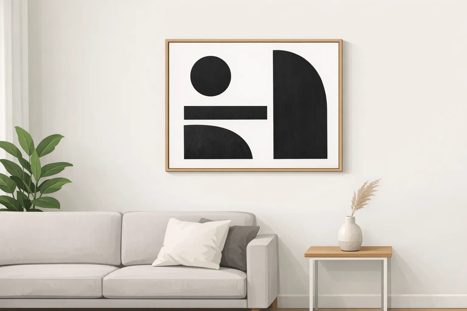
- Abstract shapes: The most “pure” minimalist choice, especially if you want the room to feel architectural.
- Photography (street, portrait, nature): Adds realism and story without adding colour. Best when the composition is simple.
- Line art: Light visual weight, excellent for small spaces or narrow walls.
- Typography: Can be minimalist, but it becomes a message in the room. Choose it only if you truly want words to be the focal point.
Try to match subject to the room’s job. A bedroom often benefits from abstraction or calm nature photography. A home office can take stronger geometry or bolder photographic contrast.
3) Visual weight: will it dominate or whisper?
Two prints of the same physical size can feel completely different.
A print feels “heavier” when it has:
- Large dark areas
- Dense detail (busy texture, lots of edges)
- A central subject with strong contrast
If you want minimalism, aim for one dominant focal point per wall. If the wall already has a TV, shelving, or a large mirror, choose a lighter print that supports the space rather than competing.
4) Negative space: does the artwork breathe?
Negative space is the empty area around the subject. It’s a key reason monochrome looks sophisticated.
If you’re not sure, choose a print where at least a third of the image is “quiet” (plain sky, blank background, open texture, or uncluttered margins). It will feel calmer and will be easier to live with long-term.
Picking the right size (without guesswork)
Minimalist styling fails most often because the art is too small for the wall. Black and white makes this more noticeable, because the room is less distracted.
A practical approach:
- Above a sofa, sideboard, or bed: Aim for artwork (or a pair/triptych) that spans roughly two-thirds to three-quarters of the furniture width.
- On a narrow wall (hallway, between windows): Go taller rather than wider. Vertical prints add “architecture”.
- For a single statement piece: Scale up. Minimalist rooms can handle larger art because there is less competing décor.
If your space allows multiple size options, treat size as part of the design, not just a budget decision.
| Placement | What usually looks “right” | What often goes wrong | Minimalist fix |
|---|---|---|---|
| Above sofa | One large piece or two medium pieces that read as one unit | A small print floating with too much wall around it | Go larger, or add a second print to create a balanced pair |
| Hallway | One tall piece or a small series with consistent spacing | Too much variation in sizes and frames | Keep one size, one frame style, consistent gaps |
| Bedroom | Medium to large, low-contrast if you want calm | High-contrast piece that feels energising at night | Choose soft greys, or add a wider white border/mount |
| Home office | One clear focal print at eye level | Busy image that competes with screens and cables | Choose simpler composition and stronger negative space |
Frame choices that still feel minimalist (but not cold)
Black and white art prints can look stark if everything is sharp black and pure white. Framing is where you can control warmth.
Black frame: crisp and architectural
A thin black frame is the classic modern choice. It works especially well when your room already has black details (lighting, window frames, chair legs).
White frame: airy and gallery-like
White frames reduce contrast at the edge of the artwork, which can make a space feel calmer. They are useful when the print itself is high-contrast.
Natural wood frame: minimalist with warmth
If your room has wood floors, oak furniture, or woven textures, natural wood frames keep monochrome from feeling too “clinical”.
Mounting and borders: the underrated minimalist tool
A mount (mat) or a generous white border gives the artwork breathing room. It also makes smaller prints look more substantial without adding visual clutter.
| If your print is… | Consider… | Why it works |
|---|---|---|
| High contrast and graphic | White mount/border | Softens the edge contrast and feels more gallery-like |
| Low contrast and subtle | Black or natural wood frame | Adds structure so it doesn’t disappear on the wall |
| Detailed photography | Slightly wider mount | Keeps fine detail from feeling cramped |
| Very minimal line art | Thin frame, generous border | Maintains lightness while still feeling “finished” |
If you’re buying ready-to-hang prints with framing available, treat the frame as part of the artwork, not an afterthought.
Room-by-room styling ideas (that stay minimalist)
Living room: one anchor, then stop
In minimalist living rooms, the best result often comes from a single strong piece, or a balanced pair.
A simple approach that looks designed:
- Choose one large black and white print with clear negative space.
- Match the frame finish to one existing room element (for example, black to match lighting, or wood to match a table).
- Keep nearby objects quiet: one vase, one stack of books, one plant.
If you want more than one piece, keep them in the same visual “family” (similar tonal range, similar margins, similar frame). The goal is cohesion, not variety.

Bedroom: prioritise softness and restraint
Black and white can feel surprisingly soothing in a bedroom if you avoid harsh contrast.
Look for:
- Soft greys, foggy landscapes, gentle abstraction
- Simpler compositions (fewer edges and hard lines)
- A slightly wider border or mount to create “breathing space”
If you like bold graphic prints, consider placing them on a side wall rather than directly above the bed, so they’re not the first thing you see when you wake.
Hallway: make it feel intentional, not like leftover wall space
Hallways are perfect for monochrome because they tend to have changing light throughout the day.
Two minimalist options:
- One tall statement piece to create a gallery corridor feeling.
- A short series of two or three prints in identical frames and sizes, with consistent spacing.
The key is repetition. Repetition reads minimalist, randomness reads cluttered.
Home office: reduce mental noise
A home office already has plenty of information: screens, cables, stationery, calendars. Black and white art should support focus.
Choose:
- A print with strong structure (geometry, architecture, simple photography)
- Medium contrast (enough to hold attention, not so much that it becomes distracting)
- One focal piece rather than multiple competing prints
If you work on video calls, placing a clean monochrome print behind you can make your background look intentional and professional.
Kitchen and dining: go graphic and durable-looking
These spaces can handle more contrast because they are active, high-energy rooms.
Graphic black and white prints, architectural photography, or bold abstract forms often work best here. Keep framing simple, and avoid very delicate, pale images that may feel washed out under bright overhead lighting.
How to combine multiple black and white prints without making the wall feel busy
Monochrome makes coordination easier, but it doesn’t automatically guarantee a minimalist result. The wall can still feel crowded if the compositions fight.
Use one of these combination strategies:
Same subject, different crops
For example, two architectural photos with similar lines, one close-up and one wider view. This feels curated because the theme is consistent.
Same tonal range, different subjects
A soft-grey landscape and a soft-grey abstract can work together even if the subjects differ, because the emotional “volume” is the same.
One hero, one supporting piece
The hero is larger or higher contrast. The supporting piece is lighter, simpler, and visually quieter.
Consistent margins and frames
If you want minimalism, consistency matters more than variety. Matching frame colour, thickness, and mount style is the fastest way to create cohesion.
Lighting: the detail that makes monochrome look expensive
Black and white prints live and die by light. The same image can look flat in dull lighting and dramatic with directional light.
Consider:
- Avoiding strong glare: If you have glass framing, angle lights carefully so reflections don’t obscure the darker areas.
- Using warm, not icy lighting: Extremely cool bulbs can make whites look harsh and can drain warmth from the room. Many homes look best with warm-white lighting for evening ambience.
- Adding a picture light (optional): Even one small light above a key piece can make the art feel intentionally “installed”.
If your room has big windows, watch how daylight moves across the wall. Prints with subtle grey detail often look best where they get indirect light rather than harsh sun.
Keeping a minimalist look over time (without redoing the room)
Minimalist interiors can slowly drift toward clutter as objects accumulate. Art is often where you can restore calm.
A simple maintenance habit: every few months, stand in the doorway and ask whether the art is still the focal point you intended. If not, remove one competing object in the surrounding area rather than changing the print.
Also, consider seasonal swaps. Black and white art prints make this easy because they pair with almost any seasonal textile change, from winter throws to summer linen.
Where Dreamprint.art fits if you’re buying, not just browsing
If you’re ready to choose artwork, it helps to prioritise three practical things alongside aesthetics:
- Made-on-demand printing: Useful when you want a specific look in a specific size without hunting through limited inventory.
- Multiple size options and framing availability: Helpful for getting proportions right and achieving a ready-to-hang finish.
- Worldwide shipping and free shipping: Important if you’re furnishing a space on a timeline or ordering from abroad.
Dreamprint.art is built around these needs, with curated posters and art prints from contemporary artists, produced on demand and shipped internationally.
The minimalist checklist (quick recap)
A black and white print will look minimalist in your space when:
- The tonal range matches the room’s existing contrast
- The subject supports the room’s purpose (rest, focus, conversation)
- The size is bold enough for the wall
- The frame and border add structure without adding noise
- The surrounding styling stays quiet so the art can breathe
If you follow those principles, monochrome stops being a “safe choice” and becomes a design decision that makes the whole room feel more intentional.


