
Cart
0
Black and white prints are one of the easiest ways to make a room feel more considered, without committing to a big colour overhaul. They work in modern flats, period homes, minimalist spaces, and colourful eclectic interiors because they add structure and contrast while staying visually “quiet” enough to live with every day.
If you have ever bought a monochrome poster you loved online, then struggled to make it look right on the wall, the fix is usually not the print itself. It is the styling decisions around it, scale, framing, spacing, lighting, and what else is happening in the room.
Why black and white prints work in (almost) every interior
Black and white artwork does three useful things in a space:
- Creates contrast without adding a new colour. This is ideal when your room already has a palette you like.
- Adds visual “rhythm”. Repeating light and dark shapes helps a room feel intentional, even when furniture is mixed.
- Highlights form and texture. Monochrome images make you notice lines, shadows, grain, brush marks, and negative space.
That is why black and white prints are often the first “proper art” people buy for a new home. They are forgiving, easy to move between rooms, and they rarely clash.
Start with the right type of black and white print for the mood you want
Not all monochrome art reads the same at a distance. Before you think about frames or placement, decide what kind of black and white energy your room needs.
Photography (sharp, modern, architectural)
Great for living rooms, hallways, and offices because photographic blacks can feel crisp and confident. Look for strong geometry, city scenes, portraits with clear lighting, or high-contrast landscapes.
Illustration and line work (clean, calm, graphic)
Perfect when you want a lighter touch. Line art pairs especially well with Scandinavian interiors, Japandi spaces, and rooms with a lot of natural materials.
Abstract monochrome (bold, gallery-like)
Abstract pieces can anchor a room in the way a rug does, they create a focal point and set the tone. Ideal above a sofa, bed, or dining table.
Typography (playful, editorial)
Typography prints can feel like design objects. Use them in kitchens, home offices, and entryways where you want a bit of personality without visual clutter.
The “read from across the room” rule: choose scale before you choose frames
A common mistake with black and white prints is buying too small, especially if the image is detailed. Monochrome detail can disappear when viewed from a few metres away.
Use these practical sizing cues:
- Above a sofa or bed: your art should typically span around two-thirds of the furniture width (whether that is one large piece or a pair).
- In a hallway: go a bit larger than you think, because narrow spaces make art feel smaller.
- On a small wall (for example, between windows): a medium print with generous white space often looks more premium than a tiny piece.
If you are unsure, a safe approach is to pick one hero piece (larger), then add smaller monochrome accents elsewhere. This keeps your home cohesive without turning every wall into a statement.

Frames, mounts, and glass: the styling choices that make monochrome look expensive
Black and white prints are more sensitive to framing than colourful art because the frame becomes part of the contrast story.
Pick a frame finish that matches the room’s “hardware”
Look at what is already fixed in the space:
- Black taps, black door handles, matte black lighting, then a black frame will look intentional.
- Brass, oak, or warm metals, then consider a light wood frame to keep the look soft.
- Stainless steel, chrome, modern gloss finishes, then a thin metallic or neutral frame can work well.
Use a mount (mat) to give the artwork breathing room
A mount is especially helpful for:
- Detailed photography
- Minimal line art
- Smaller prints that you want to feel more “gallery”
The mount adds negative space, which makes monochrome art look calmer and often more premium.
Mind the glare
If your print is opposite a window, glare can flatten blacks and reduce contrast. If you can, place monochrome pieces on walls that get indirect light, or choose glazing options that reduce reflections.
Styling black and white prints room by room
Different rooms need different “jobs” from art. Use the room’s function to guide subject matter, contrast, and placement.
| Room | What works best | Contrast level | Placement tip |
|---|---|---|---|
| Living room | Bold abstract, architectural photography | Medium to high | Anchor the seating area with one larger piece or a balanced pair |
| Bedroom | Soft line art, calm photography, minimal abstracts | Low to medium | Keep it centred above the bed, avoid overly busy detail |
| Kitchen | Typography, simple illustration, food or city details | Medium | Go for wipeable locations and avoid spots near heavy steam |
| Hallway | High-contrast photography, graphic shapes | Medium to high | Hang slightly higher than in living spaces if the corridor is narrow |
| Home office | Clean graphics, inspiring typography, structured abstracts | Medium | Position within your sightline from the desk, not too high |
| Bathroom | Minimal line art, small abstracts | Low to medium | Choose a safe position away from direct splashes |
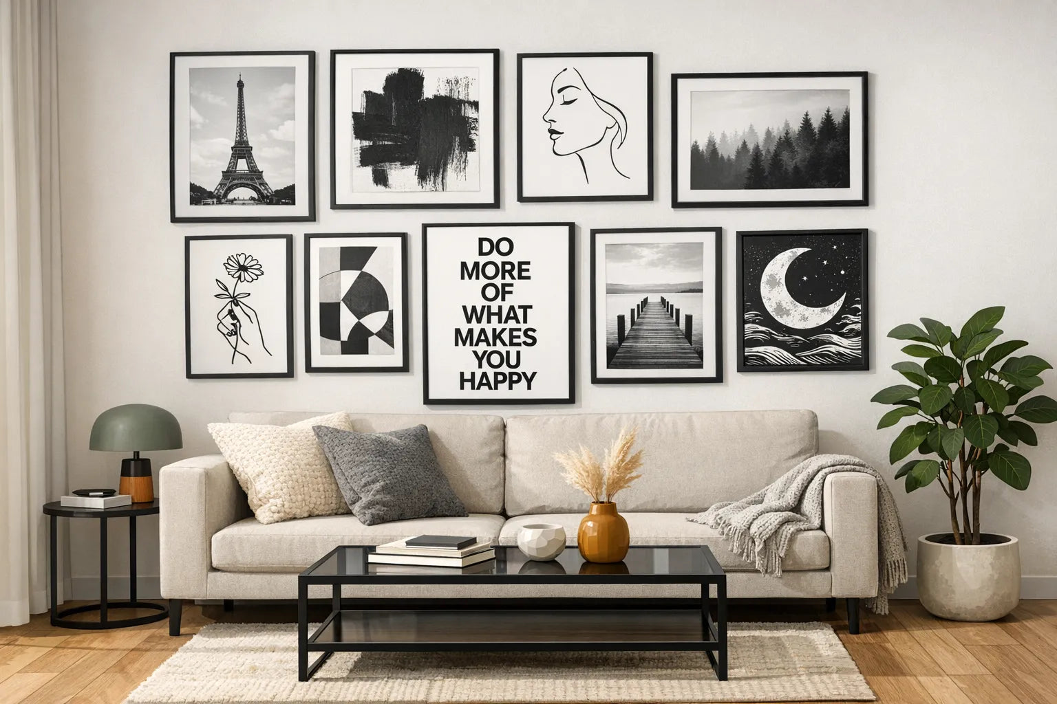
Living room: let one monochrome piece “lead”
In a living room, black and white prints work best when they create a clear focal point.
Try one of these approaches:
- One large statement print above the sofa to ground the whole seating area.
- Two similarly sized prints side by side for symmetry.
- A triptych (three pieces) if your wall is wide and your furniture is low.
To stop monochrome feeling harsh, bring in texture nearby, a wool throw, boucle cushion, linen curtains, or a textured rug.
Bedroom: keep it soft, not stark
High-contrast black can feel energising, which is not always what you want in a bedroom. For restful styling:
- Choose prints with more mid-tones (greys) and gentle gradients.
- Pair with warm neutrals (cream, taupe, warm white) so the room does not feel cold.
- Consider a lighter frame (oak or white) if your bedroom is small.
Kitchen: make it graphic and simple
Kitchens are busy spaces visually, with tiles, appliances, utensils, packaging. Monochrome works well when it is straightforward.
Good choices:
- Typography that feels editorial
- Simple illustration
- High-contrast photography with a single clear subject
If your kitchen is mostly white, black and white prints can add definition without making the room feel crowded.
Hallway and entryway: use contrast to create “arrival”
A hallway is a transitional space. Black and white prints shine here because they create impact without needing matching colours.
Two easy wins:
- Choose a piece with a clear silhouette or strong geometry.
- Repeat a frame colour (all black, all oak) to make the corridor feel intentional.
Home office: choose art that supports focus
For productivity, avoid prints that feel visually noisy.
- Abstracts with structured shapes can feel calming.
- Architectural photography can create a sense of order.
- Typography can work, but keep it minimal so it does not become visual clutter during calls.
If you care about your video-call background, a single well-framed black and white print behind you reads clean and professional.
Bathroom: small monochrome, big payoff
Bathrooms often get overlooked, which makes them perfect for a small black and white upgrade.
Aim for:
- Simpler imagery
- Smaller sizes
- A frame finish that matches taps or shower hardware
Place it where humidity and splashes are less likely, and make sure ventilation is good.
How to pair black and white prints with colour (without losing the monochrome magic)
Black and white prints do not mean a black and white room. In fact, they often look best with a controlled use of colour.
Use one accent colour nearby
Pick a single colour that appears in:
- cushions
- a vase
- a lamp shade
- a chair
Because the print is monochrome, your accent colour reads stronger and more deliberate.
Match undertones for a more cohesive look
“White” is not always the same white.
- In rooms with warm paints (cream, ivory), choose prints with softer whites and natural textures.
- In rooms with cool paints (bright white, grey), crisp high-contrast prints can look sharper.
Let materials do the warming up
If you love high-contrast black and white prints but worry they will feel cold, add warmth through materials:
- oak, walnut
- rattan, leather
- linen and wool
- clay and stone
This keeps the graphic look but makes the room feel lived-in.
A simple lighting check that instantly improves monochrome art
Black and white prints look best when light supports their contrast rather than flattening it.
- Avoid direct glare from windows or strong ceiling spots.
- Use side lighting (a floor lamp nearby) to bring out texture in paper and framing.
- If you have picture lights or adjustable spots, aim for a gentle angle rather than straight-on brightness.
Even small lighting tweaks can make blacks look deeper and whites look cleaner.
Common styling mistakes (and quick fixes)
Mistake: the print feels “lost” on the wall
Fix: size up, add a mount, or move the piece above a larger anchor (a console table, sofa, bed) so the wall does not overwhelm it.
Mistake: everything is monochrome and the room feels flat
Fix: add one accent colour and at least two different textures (for example, linen curtains and a wool rug).
Mistake: frames clash with the rest of the room
Fix: match frame finish to what is already repeated in the space (black metal, warm wood, brass accents). Consistency is more important than the “perfect” frame.
Mistake: the art feels too harsh for a cosy room
Fix: choose lower-contrast imagery, use a lighter frame, or introduce softer textiles nearby.
Styling tip: coordinate your room’s vibe beyond the walls
If your room has a strong cultural or music identity (a listening corner, a DJ setup, a streetwear wardrobe area), black and white prints can reinforce that mood without becoming theme decor. Pair a crisp monochrome poster with darker textiles, minimal shelving, and a small selection of objects that feel connected to the same world.
For example, if your space leans club-inspired or streetwear-forward, you might complement a monochrome wall with a statement piece from ClubWhere to keep the overall look cohesive across art, clothing, and accessories.
Choosing prints online: what to look for so they style easily
When you are buying black and white prints for your home, look for listings that make it easy to choose confidently:
- Multiple size options so you can match the scale to your wall.
- Framing available if you want a ready-to-hang finish.
- Clear product photography that shows contrast and detail.
- Secure checkout and reliable shipping, especially if you are ordering internationally.
At dreamprint.art, prints are made on demand and shipped worldwide, with framing options and ready-to-hang formats available, which makes it easier to treat styling as the final step, rather than a DIY project that drags on.

Bringing it all together
Black and white prints are versatile because they behave like design structure rather than decoration. Get the scale right, pick frames that match your room’s finishes, add texture to soften the contrast, and use lighting that supports the image.
Once those basics are in place, you can style monochrome art in any room, from a calm bedroom to a high-impact hallway, without needing to redesign your entire home.


