
Cart
0
“Museum quality” is one of the most-used (and most-misunderstood) phrases in the art print world. Sometimes it genuinely signals exceptional materials and careful production. Other times it is a vague marketing label.
If you are shopping for fine art prints for your home or office, knowing what museum quality actually involves helps you buy with confidence and avoid prints that fade, yellow, or simply look “off” compared to the artist’s original.
What does “museum quality” really mean?
There is no single global legal definition of “museum quality” for art prints. Museums themselves buy, commission, and display work across many media, from oil paintings to photographs to modern digital prints.
In practice, “museum quality” usually means the print is made to a conservation-minded standard, with attention to:
- Longevity (archival paper and stable inks)
- Colour accuracy (controlled colour management)
- Craft (sharp detail, clean borders, careful handling)
- Display readiness (mounting and framing that does not damage the art)
A useful way to think about it is: Would a museum be comfortable exhibiting this for years without it degrading quickly, and could it be stored safely for decades?
The museum-quality checklist (the parts that matter)
Before we go deeper, here is a quick overview of the main factors that separate premium fine art prints from “poster prints”.
| Factor | What “museum quality” looks like | What to watch out for |
|---|---|---|
| Paper | Acid-free, lignin-free, typically cotton rag or high-grade alpha-cellulose | Thin stock, unknown paper type, visible yellowing over time |
| Inks | Pigment inks (common in giclée), chosen for stability | Cheap dye inks with poor lightfastness |
| Colour workflow | Calibrated equipment, ICC profiles, consistent proofing | “Looks fine on screen” with no colour control |
| Detail | Appropriate file resolution, crisp edges, smooth gradients | Blurry textures, banding in skies, noisy shadows |
| Finishing | Clean trimming, careful packaging, minimal scuffs | Fingerprints, bent corners, roller marks |
| Framing and mounting | Acid-free mount/backing, UV-filter glazing options | Adhesive mounting, acidic backing boards |
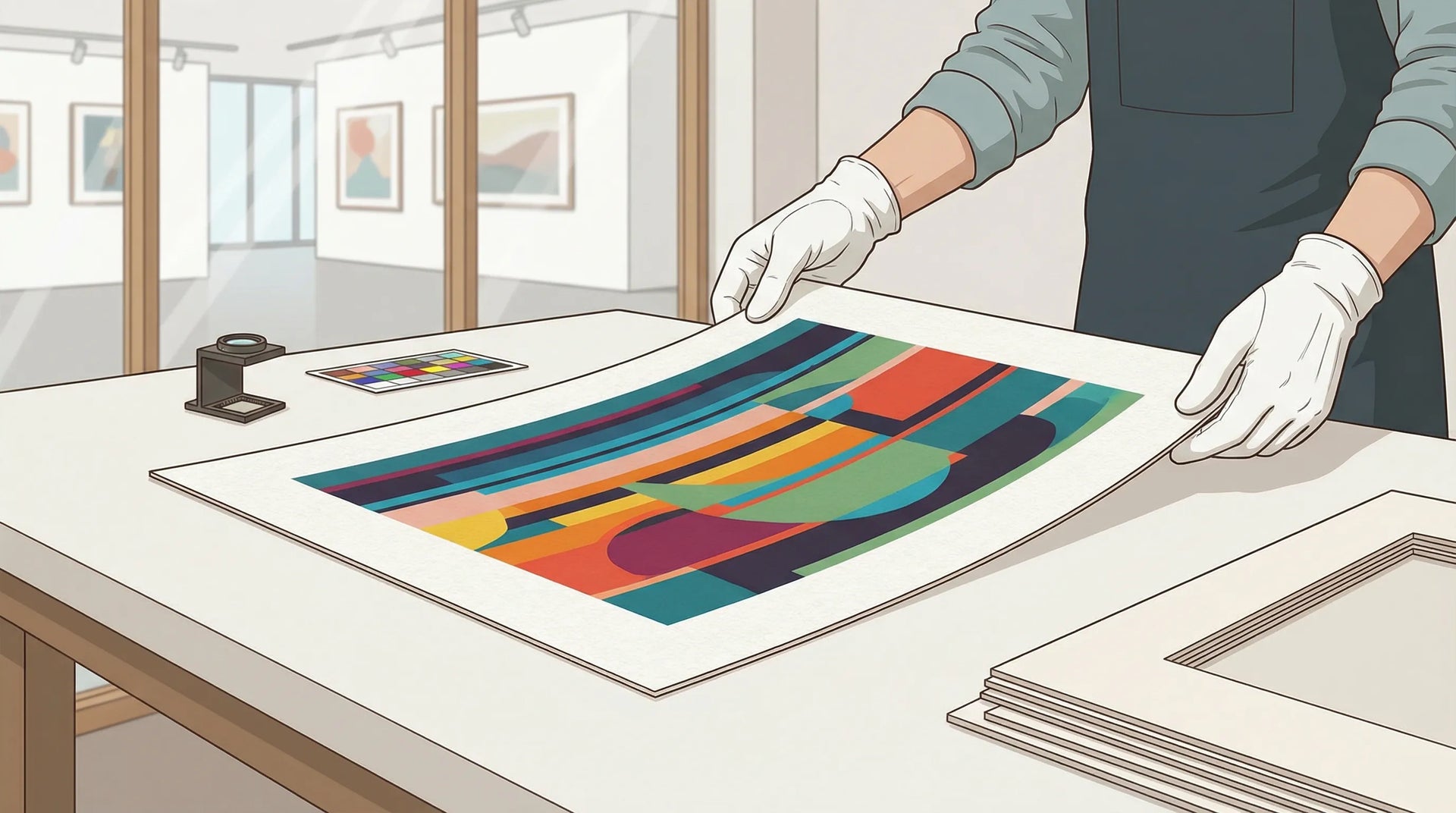
1) Paper: the foundation of museum-quality fine art prints
Paper is not just “something to print on”. In fine art printing, it is part of the artwork’s surface, texture, and longevity.
Cotton rag vs alpha-cellulose (and why both can be excellent)
Two common categories dominate high-quality fine art prints:
- 100% cotton rag: prized for its texture, weight, and archival reputation. Cotton fibres can be very stable over time.
- Alpha-cellulose (high-grade wood pulp): when made to archival standards (acid-free, lignin-free), it can also offer long life and beautiful results.
A well-made alpha-cellulose paper can outperform a poorly made cotton paper, so do not judge by fibre type alone. Look for the full specification.
Acid-free, lignin-free, buffered: what these terms mean
- Acid-free: helps prevent paper from becoming brittle and yellowing.
- Lignin-free: lignin is a component in wood pulp that can contribute to discolouration as it breaks down.
- Buffered: an alkaline reserve (often calcium carbonate) that helps resist acidification over time.
One widely referenced benchmark for “permanent” paper is ISO 9706 (requirements for permanence), which covers properties like pH and tear resistance. You can see the standard overview on the ISO 9706 page.
Optical brightening agents (OBAs): bright whites, potential trade-offs
Some papers include optical brightening agents to make whites look cooler and brighter. OBAs can make colours pop, but they may diminish over time, potentially changing the perceived paper tone.
This is not automatically “bad”, it is a choice. For a more classic, warm fine art look, many collectors prefer papers with low or no OBAs.
Common museum-quality paper styles (and what they are good for)
| Paper style | Best for | Look and feel | Notes |
|---|---|---|---|
| Matte cotton rag | Illustrations, painterly work, soft photography | Velvety, low glare, tactile | Excellent for gentle tonal transitions |
| Smooth matte (cotton or alpha-cellulose) | Minimalism, typography, crisp line work | Cleaner surface, sharp edges | Often favoured for graphic work |
| Baryta / fibre-based (photo-style) | High-contrast photography, rich blacks | Slight sheen, deep Dmax | Closer to traditional darkroom prints |
| Canvas | Large statement pieces, painterly aesthetics | Textured weave | Often finished with protective coatings |
2) Ink and print method: why “giclée” is often mentioned
When people talk about museum-quality fine art prints, you will frequently see “giclée”. The term is commonly used for high-end inkjet printing, usually with pigment inks, on premium fine art papers.
Pigment inks vs dye inks
- Pigment inks suspend solid pigment particles and are typically chosen for longevity and stability.
- Dye inks are colourants dissolved into liquid, often capable of very vivid colour but (in many consumer-grade systems) less resistant to light exposure.
Lightfastness depends on the complete system (ink set, paper, protective coatings, display conditions), but pigment ink workflows are a common route to archival-quality results.
For longevity discussions and test methodologies, Wilhelm Imaging Research is a frequently cited authority in print permanence research. Their site is a useful starting point: Wilhelm Imaging Research.
Other print methods you may encounter
Not all excellent prints are giclée. Museums exhibit chromogenic photographs, etchings, lithographs, and more. Here is a practical comparison for online shopping:
| Method (common name) | Typical use | Strengths | Potential limits |
|---|---|---|---|
| Pigment inkjet (often called giclée) | Fine art prints on cotton rag, photo papers | Detail, wide gamut, archival potential | Quality depends heavily on calibration and materials |
| Chromogenic (C-print) | Colour photography from photo labs | Familiar photo look, smooth tones | Longevity varies by materials and display conditions |
| Offset lithography | Posters, high-volume art books | Cost-effective for large runs | Not inherently “inferior”, but many mass posters use lower-grade paper |
| Laser/toner | Office and quick-print | Convenience | Typically not aimed at archival collecting |
The takeaway: “museum quality” is not one technology, it is a standard of materials and control.
3) Colour accuracy: the invisible work behind museum-quality prints
A print can be on perfect paper with great inks and still disappoint if the colour workflow is careless.
Museum-quality printing is about repeatability. If you buy today and buy again in a year, the colours should be consistent. If an artist’s shadows are meant to be deep and neutral, they should not drift green. Skin tones should not skew orange. Subtle gradients should not band.
Key practices include:
- Calibrated monitors for editing and proofing
- ICC colour profiles matched to paper and printer combinations
- Soft proofing (previewing on screen how the print will render)
- Controlled lighting for evaluating physical prints
If a seller cannot tell you what paper is used or how colour is managed, “museum quality” is mostly a hope.
4) Sharpness and resolution: what matters at real viewing distances
Online listings sometimes reduce print quality to “300 DPI”, but that phrase is often used loosely.
What matters is:
- The native resolution of the artwork file (not an upscaled version)
- The viewing distance (a large print is typically viewed from further away)
- The type of artwork (fine line drawings need more crispness than abstract washes)
Red flags include:
- Blurry edges on text or line art
- Visible pixelation in gradients or geometric shapes
- Moiré patterns in scanned work (especially textiles or halftone sources)
A museum-quality print should look intentional up close, not “good enough from the sofa”.
5) Craft and finishing: the details collectors notice
Two prints can come off the same printer and still feel wildly different depending on finishing standards.
Museum-quality finishing usually includes:
- Clean trimming (no jagged edges)
- Consistent borders (if a border is part of the design)
- Careful handling (no scuffs, dents, or fingerprints)
- Protective packaging suitable for shipping without corner damage
This is also where made-on-demand production can be a strength when done well, every print is produced fresh and packed for a single destination, rather than sitting in storage and picking up wear.

6) Framing and mounting: “museum quality” is not just the print
Even a truly archival print can be damaged by poor framing.
Mounting materials should be conservation-safe
Look for:
- Acid-free mounts and backing boards
- Non-damaging hinging methods (rather than full-surface adhesive mounting)
- A frame build that keeps the print flat without stressing the paper
Poor-quality boards can off-gas acids over time and cause staining or yellowing, especially around the edges.
Glazing: standard glass vs UV protection vs “museum glass”
Glazing affects both appearance and longevity.
- Standard glazing protects from dust and handling
- UV-filter glazing helps slow fading from light exposure
- “Museum” glazing (often used to describe high-clarity, low-reflection options) improves viewing and reduces glare
If you are placing art in a bright room, UV protection is one of the most practical upgrades you can make.
For general guidance on caring for and displaying works on paper, conservation resources like the American Institute for Conservation are a helpful reference point.

7) Longevity in the real world: light, humidity, and where you hang it
Museums control temperature, humidity, and lighting. Homes do not, so the “museum quality” promise depends partly on you.
Three practical rules:
- Avoid direct sunlight. Even stable pigment systems will fade faster under intense UV.
- Be careful with humidity. Bathrooms and kitchens can stress paper and encourage warping.
- Keep away from heat sources. Radiators and fireplaces create local microclimates.
If you want a conservative approach, institutions like the Library of Congress publish practical preservation guidance. Their general preservation resources are a good starting point: Library of Congress Preservation.
8) Editioning, authenticity, and “museum quality” marketing
Museum quality is about materials and production, but buyers often associate it with collectability.
You may see:
- Open edition prints (unlimited)
- Limited edition runs (fixed number of copies)
- Artist signatures, numbering, or certificates
Limited editions can be meaningful, but they are not automatically higher quality. Conversely, open editions can be made to exceptional standards.
If you care about collectability, look for clarity on:
- Whether the edition is limited and how it is controlled
- Whether the artist approves the final file/colour
- Whether the print is signed (physically or digitally) and what that means
9) How to evaluate “museum quality” before you buy online
Product pages vary, but a trustworthy listing usually answers most of these without you chasing support.
- Paper type (cotton rag, alpha-cellulose, baryta) and whether it is acid-free/lignin-free
- Ink type (pigment vs dye) and printing method
- Available sizes and how cropping is handled
- Framing and mounting materials (acid-free backing, UV options)
- Packaging and shipping approach (especially for international delivery)
- Clear photos showing texture and finish, not only mock-ups
If you are also planning how to display multiple pieces, you may find this guide useful: How to Create the Perfect Gallery Wall.
Bringing it all together: what “museum quality” should mean to you
When you buy fine art prints labelled “museum quality”, you are really buying a chain of decisions: paper chemistry, ink stability, colour control, finishing discipline, and conservation-safe display options.
The best results come when all of those choices align with your space and the artwork itself. A matte cotton rag print can look stunning in a softly lit bedroom. A baryta-style print can make photography feel deep and dimensional in a hallway. Add conservation framing and sensible placement, and you are much closer to what museums aim for: art that looks right today, and holds up over time.


