
Cart
0
Choosing high quality art print paper is one of the biggest decisions you can make for how a poster or print actually looks on your wall. The same artwork can feel soft and painterly or sharp and high contrast, simply based on the paper beneath the ink. This guide breaks down what matters, how to read paper specs, and how to pick the right surface for your space and subject.
Why paper choice matters for art prints
Paper is the canvas for your print. It controls colour saturation, shadow detail, sharpness, texture, glare and even long term stability. Archival papers and pigment inks can keep colours looking rich for decades, while the wrong surface can introduce glare or flatten tones.
Independent testing by organisations like Wilhelm Imaging Research shows that pigment inkjet prints on archival papers can achieve display lifetimes measured in many decades with proper framing and light levels. In other words, the paper and ink pairing you choose today shapes how your art will look years from now.

The anatomy of high quality art print paper
Understanding a few core specs will help you compare options with confidence.
1) Paper weight and thickness
- GSM indicates weight per square metre. As a very general guide, 170 to 230 gsm is common for posters, 240 to 320 gsm is typical for fine art inkjet papers, and above 320 gsm is very heavy stock.
- Heavier papers feel more premium and resist cockling, but thickness also affects framing choice. Very thick papers may need deeper mounts and firm backing.
2) Base composition
- Cotton rag, made from cotton linters, is naturally acid free and prized for archival stability and a tactile fine art feel.
- Alpha cellulose, high purity wood pulp, is also excellent when acid free and lignin free. Many premium photo and fine art papers use this base.
- Alternative fibres like bamboo or hemp offer distinct textures and sustainability benefits.
Look for acid free and lignin free language, or reference to the ISO 9706 permanence standard.
3) Coating type
- Inkjet receptive coatings create sharp detail and vibrant colour. Fine art coatings emphasise texture and subtlety, photo coatings maximise Dmax, the deepest black, and crispness.
- RC photo papers, resin coated, have a polyethylene layer for dimensional stability and quick drying. Fibre or baryta papers mimic traditional darkroom fibre prints with elegant sheen and deep blacks.
4) Surface texture
- Smooth surfaces suit detailed line work, typography and crisp photography.
- Lightly textured or mould made surfaces add character and soften hard edges, wonderful for watercolour reproductions and painterly images.
- Strong textures are evocative but can scatter light and slightly reduce perceived sharpness.
5) Shade and optical brightening agents
- Paper white can be natural warm white, neutral white or bright white. The shade influences colour rendering and skin tones.
- Optical brightening agents, OBAs, create a bright white by fluorescing under UV. They maximise pop but can impact long term stability or shift in look under different lighting. The Canadian Conservation Institute has a helpful primer on optical brighteners in paper.
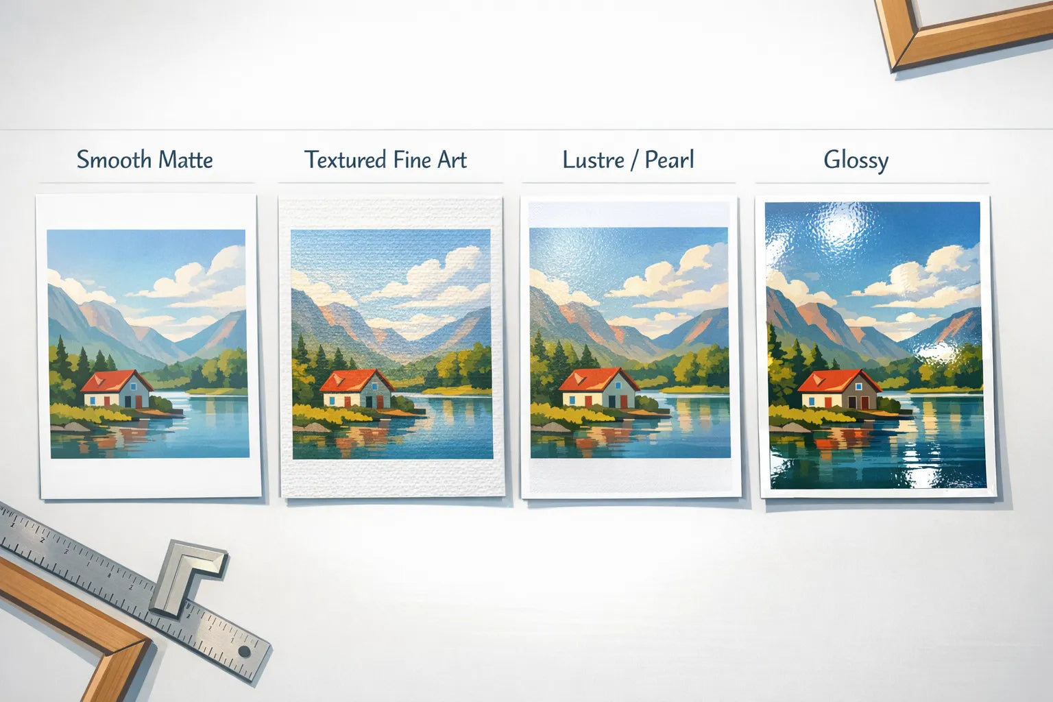
Finish types and when to choose each
| Finish | Surface | Pros | Considerations | Best for |
|---|---|---|---|---|
| Matte fine art | Non reflective, smooth to lightly textured | Zero glare, elegant, soft tonal transitions, tactile feel | Slightly lower perceived contrast compared to glossy, darker prints can feel more subdued | Drawings, watercolours, illustrations, minimalist photography |
| Lustre or pearl | Subtle sheen, micro texture | Excellent all rounder, strong colour and contrast, reduced reflections versus glossy | Still some reflections near windows or direct lights | Portraits, landscapes, colourful photography |
| Glossy photo | High sheen, very smooth | Maximum contrast and apparent sharpness, deep blacks | High reflections, fingerprints visible, needs careful lighting | Highly saturated photography, high contrast work |
| Baryta or fibre gloss | Elegant sheen, fibre base | Rich Dmax, classic darkroom look, superb for monochrome | Premium cost, sensitive to handling before framing | Black and white photography, fine art colour |
If you are in a very bright room or directly opposite windows, matte is often the safest choice to avoid glare.
Colour accuracy, inks and longevity
Paper is only half of the equation. Inkset and print process complete the picture.
- Pigment inks, used for giclée fine art printing, deliver excellent colour stability and water resistance. Dye inks can look very vibrant but are usually less lightfast.
- High quality art print paper should be paired with pH neutral, acid free bases and archival inks. When framed behind UV protective glazing and kept out of direct sun, longevity is significantly improved. See the Library of Congress advice on paper permanence and care.
- Dmax and gamut matter for deep shadows and vivid colour. Photo oriented papers often push both, while cotton rag papers prioritise nuance and texture.
Match paper to subject and space
A sensible way to choose high quality art print paper is to combine what the artwork needs with where it will live.
- Bold, colourful photography, choose lustre or pearl to balance vibrancy and controlled reflections.
- Black and white photography, choose baryta or fibre gloss for depth and neutrality, or matte fine art for a softer museum look.
- Watercolour and painterly art, choose textured matte cotton rag to echo the original medium.
- Line drawings, typography, architectural prints, choose smooth matte for precision and crisp edges.
Room conditions matter too.
- Bright rooms or opposite windows, go matte to reduce glare.
- Mixed lighting and multipurpose spaces, lustre is a safe all rounder.
- Dim or gallery style lighting, you can enjoy glossy or baryta surfaces for maximum depth.

Sustainability signals to look for
- FSC or PEFC certified papers indicate responsible forestry. Learn more at the Forest Stewardship Council.
- Recycled or alternative fibre blends, for example bamboo or hemp, reduce reliance on virgin wood pulp.
- ECF or TCF bleaching processes and ISO permanence references indicate careful manufacturing.
Sustainable options can still deliver outstanding colour and longevity when paired with the right coatings and inks.
How to read a product page for paper quality
Use this quick checklist to understand what you are buying.
- GSM or paper weight, look for 200 gsm and above for a premium feel, heavier for fine art editions.
- Base and pH, acid free, lignin free, cotton or alpha cellulose.
- Finish, matte, lustre, glossy, baryta or fibre.
- Texture, smooth, lightly textured, pronounced.
- Coating, fine art inkjet or photo RC, note whether it is giclée quality.
- Shade and any mention of OBAs, decide whether you prefer natural white or bright white.
- Archival or permanence notes, references to ISO 9706 or museum grade.
- Compatibility with framing, thickness and any advice on mounts or glazing.
If a detail is not listed, it is fine to ask before you buy. A good retailer will tell you the paper family and finish so you can decide with confidence.
Common myths about art papers, explained
- Heavier is always better, heavier feels premium, but the best choice is the one that suits your art and lighting. A 250 gsm fibre gloss can outperform a 320 gsm generic matte for tonal depth in black and white.
- Glossy always looks more vibrant, it can, but heavy reflections can hide detail in bright rooms. Lustre and matte often win for real world viewing.
- All giclée prints are the same, giclée refers to inkjet fine art printing with pigment inks, but paper coatings, profiles and printer models vary. Results still depend on the entire system.
- Photo paper equals cheap, premium RC and fibre based photo papers are industry standards for gallery work and can be extremely archival.
Choosing by collection and style
Once you know the paper character you want, it becomes easier to shop by subject. Explore curated collections and pair them with the surface that suits your space.
- Vibrant, graphic compositions, try Abstract Posters, they sing on lustre or pearl for punchy colour without harsh glare.
- Moody monochrome or classic film looks, browse Black and White Photography Prints and consider baryta or a smooth matte for a gallery calm.
- Soft, organic motifs, explore Botanical Art Prints, a lightly textured matte cotton stock complements natural subjects.
- Clean lines and negative space, see Minimalist Art Prints, smooth matte keeps type and geometry crisp.
- Colour led interiors, shop Blue Posters and match finish to your room lighting for the right balance of depth and reflection.
Framing, glazing and display tips
- Use a rigid backing and a quality mount to keep prints flat. Heavier stocks are more resistant to rippling.
- Choose UV protective glazing, acrylic or glass, to slow fading and protect from dust and handling.
- Anti reflective glazing reduces glare, especially important for glossy and lustre surfaces near windows.
- Avoid direct sun, place prints away from radiators and high humidity, and dust frames gently with a soft microfibre cloth.
For more detailed display guidance, conservation bodies like the Library of Congress offer practical advice on care and display of works on paper.
Quick recommendations by scenario
- Unsure and want a safe bet, lustre or pearl. Versatile, vibrant, fewer reflections than glossy.
- Bright living room with big windows, matte fine art. Zero glare and a refined look.
- Black and white centrepiece, baryta or fibre gloss for rich blacks and a classic finish.
- Delicate watercolour reproduction, textured cotton rag for authentic feel.
- Design print or typography over a sofa, smooth matte to keep lines extra clean.
Frequently Asked Questions
What is giclée printing? Giclée is a fine art inkjet process that typically uses pigment inks and archival papers to achieve wide colour gamut, deep blacks and excellent longevity.
Is a higher GSM always better? Not always. Heavier stocks feel more substantial and can resist waviness, but the best choice depends on finish, texture and your framing setup.
Do I need UV glazing? It is recommended for any valuable print. UV glazing reduces light damage and helps keep colours stable longer.
Will matte paper make colours look dull? High quality matte papers can carry rich colour, especially with modern pigment inks. They will look less glossy and contrasty than a true gloss, but that is often desirable in real room lighting.
Are optical brighteners bad? OBAs are not inherently bad. They provide a crisp white. Some conservators prefer OBA free papers for maximum long term stability. It is a personal and project based choice, see the CCI note on optical brightening agents in paper.
How long will my print last? With pigment inks on archival papers, framed with UV glazing and kept out of direct sunlight, display life can be measured in decades. See test data from Wilhelm Imaging Research.
Bring it home with dreamprint.art
Browse curated collections by theme and colour, pick the size that fits your space, and choose framing for a ready to hang finish. At dreamprint.art, prints are made on demand, shipped internationally, and checkout is secure with excellent service. Free shipping is available, so you can focus on finding the right artwork for your room. If you are deciding between finishes or sizes, contact support and we will help you choose a paper and presentation that suits your lighting, style and subject.
Get Inspired: High Quality Prints Worth Framing
Now that you understand what makes art print paper high quality, here are some beautiful prints from our collection that showcase premium paper at its finest:

This delicate botanical artwork truly shines on high-weight archival paper, where the premium 250+ GSM stock provides excellent durability while the acid-free composition ensures the soft, natural colors remain vibrant for decades.

The bold graphic design benefits from premium matte paper with a smooth texture, allowing the crisp lines and saturated colors to stand out without any glare, perfect for modern interiors with abundant natural light.

This charming illustration looks exceptional on museum-quality paper, where the high GSM weight prevents any show-through and the archival properties ensure this whimsical piece will maintain its crisp contrast for years to come.

The dreamy, nostalgic quality of this photograph is beautifully preserved on premium semi-gloss paper, where the subtle texture adds depth while the heavyweight stock ensures the print lies flat and resists warping over time.

This vibrant retro design pops on high-quality paper with excellent color reproduction, where the premium coating ensures the bold hues remain fade-resistant and the substantial weight gives the print a luxurious, professional feel.
Looking for more inspiration? Browse our Autumn posters collection for warm, seasonal artwork, or explore our Cat posters collection for charming feline-themed prints that bring personality to any space.


