
Cart
0
Choosing the “best” art prints in 2025 is less about chasing a single trend and more about matching mood, function, and scale to each room. A print that feels energising in a kitchen can feel too loud in a bedroom, while a subtle monochrome piece that works in a hallway might get lost above a large sofa.
There’s also a practical upside to getting this right: art is one of the most flexible ways to change how a space feels without redecorating. The World Health Organization’s evidence review on arts and health highlights consistent links between arts engagement and wellbeing, including stress reduction and improved quality of life. At home, that translates into one simple goal: choose prints that support how you want each room to feel, day to day.
What “best art prints” means in 2025 (and how to decide fast)
Before going room by room, use this quick filter. It prevents common mistakes like buying a beautiful print that ends up feeling “wrong” once it’s on the wall.
1) Start with the room’s job
Every room has a primary purpose (rest, focus, socialising, transition). In 2025, the strongest interiors are intentional about this, mixing comfort with personality rather than treating art as a last-minute accessory.
2) Choose a mood dial: calming, energising, or grounding
Think of prints as a visual “volume knob”.
- Calming: soft landscapes, minimal line work, gentle gradients, muted palettes.
- Energising: bold colour blocks, dynamic abstracts, graphic photography, playful illustration.
- Grounding: earthy tones, organic shapes, nature motifs, tactile-looking compositions.
3) Get scale right first, then pick the artwork
Scale is the silent dealbreaker. If you only remember one rule: bigger than you think, but not wider than the furniture it sits above.

4) Decide your finish: unframed, framed, or ready-to-hang
If you want the easiest path to a polished look, choose ready-to-hang options (especially for living rooms and hallways where the wall is more “public”). If you like switching things up seasonally, unframed prints can be a flexible choice.
Best art prints for each room in 2025
The ideas below are designed to match how people use rooms now (more hybrid work, more multifunctional spaces, more emphasis on comfort). Use them as a starting point, then tailor by colour and size.
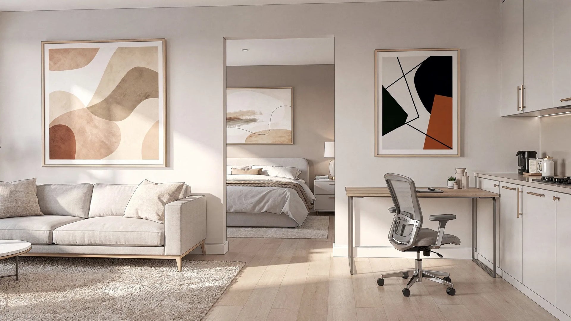
Living room: statement pieces that hold the space together
The living room is still the “anchor” room, even in smaller homes. In 2025, the most effective living-room art tends to do one of two things: create a focal point or pull together a mixed palette.
Great print directions for living rooms
- Large-scale abstract (especially with one dominant tone pulled from your soft furnishings).
- Contemporary figurative work for a curated, gallery-like feel.
- Architectural or landscape photography for calmer, timeless impact.
Placement tip: above a sofa, aim for artwork that spans roughly two-thirds to three-quarters of the sofa’s width (as a visual guideline), and hang so the centre of the piece lands around typical eye level.
Bedroom: calming art that supports sleep (without being boring)
Bedrooms benefit from art that’s visually quieter. The goal is not to make the room bland, it’s to avoid constant “visual problem-solving” when your brain wants to switch off.
What works especially well in 2025
- Soft nature motifs (botanical forms, horizons, water, clouds).
- Minimal line drawings and negative space.
- Muted abstracts with gentle contrast.
Colour tip: if your bedroom already has strong colour (feature wall, bold bedding), consider prints that repeat that hue in a desaturated way, rather than adding a new competing colour.
Kitchen: smaller prints with personality and wit
Kitchens have more visual “noise” (tiles, appliances, cookware), so art works best when it’s simple, bold, and easy to read from a distance.
Reliable choices
- Graphic illustration (food, everyday objects, playful shapes).
- Typographic prints with a clean, modern layout.
- Punchy colour studies that echo your kitchen accents.
Practical tip: choose sizes that fit narrow wall sections (A4, A3, 30x40 cm), and consider framing for easier wipe-down of surrounding areas.
Dining room: conversation starters that don’t compete with the table
Dining rooms benefit from art that feels intentional and slightly elevated. In 2025, many dining spaces are also “flex rooms”, so art that feels curated helps signal that the space is for gathering, not just passing through.
Best directions
- Still life (modern, not overly traditional).
- Moody photography (food, city nights, minimal interiors).
- Abstracts with depth (layering, texture-like forms).
Lighting tip: if you have a pendant light, avoid glass-heavy frames that create harsh reflections. A matte frame or carefully placed wall lighting will keep the piece legible at night.
Home office: focus-friendly prints that reduce visual clutter
With hybrid work now the norm for many households, the home office wall matters more than ever. The best office art in 2025 is either structured and calming (for deep work) or aspirational (for energy and confidence), but rarely chaotic.
Good choices
- Geometric abstracts with clear structure.
- Minimal architecture and clean photographic compositions.
- Limited-palette colour fields (two to four colours).
Video-call friendly tip: if your desk faces the wall, choose a piece that reads well on camera, clear shapes, medium contrast, and avoid extremely fine detail.
Hallway and landing: cohesive series that makes the home feel curated
Hallways are transition zones, which makes them perfect for either a tight series (same style, different images) or a strong, singular piece that sets the tone.
What works
- A series of two to four prints in a consistent palette.
- Black-and-white photography for timeless cohesion.
- Line art for narrow walls.
Scale tip: tall, vertical pieces often look better than wide pieces in tight hallways because they keep the corridor feeling open.
Bathroom: spa-like minimalism (with materials that suit humidity)
Bathrooms are ideal for calm, simple art. The main constraint is moisture, so choose framed options when possible and ensure good ventilation.
Best directions
- Minimal abstracts in sand, stone, and warm grey tones.
- Ocean and water themes (subtle, not overly literal).
- Botanicals that nod to freshness.
Placement tip: avoid hanging prints directly next to the shower if the room stays damp for long periods.
Children’s room: joyful prints that can “grow up” with them
The best kids’ room art in 2025 balances playfulness with design longevity.
Smart choices
- Simple character illustration with a limited palette.
- Animals and nature in modern, graphic styles.
- Soft educational typography (letters or words) that doesn’t feel overly primary-school.
Longevity tip: choose one or two “forever” prints (clean illustration, gentle colours), then swap smaller pieces as their interests change.
2025 style directions that work across the whole home
If you want your rooms to feel connected (but not identical), build your selection around one or two of these style pillars.
Organic minimalism (warm, tactile, calm)
Expect to keep seeing curved shapes, earthy palettes, and compositions that feel tactile, even on paper. These prints are especially strong in bedrooms, bathrooms, and living rooms.
Elevated colour (bold, but controlled)
Rather than chaotic maximalism, the 2025 look is often one or two confident colours used with restraint. Great for kitchens, dining rooms, and home offices.
Modern nostalgia
Vintage-inspired compositions, retro colour cues, and classic photography styles are back, but with cleaner layouts and contemporary printing.
Size and placement cheat sheet (so your prints don’t look “lost”)
Use this table as a practical guide for common wall situations. It’s not a strict rule, but it will keep you in the right range.
| Location | Best starting size | Why it works | Quick placement note |
|---|---|---|---|
| Above a 2–3 seat sofa | 50x70 cm to 70x100 cm (or a pair of 50x70 cm) | Prevents the “postage stamp over sofa” look | Keep the bottom edge comfortably above the sofa back |
| Above a double/king bed | 70x100 cm (or two tall prints) | Adds calm focus without clutter | Avoid very busy detail near the headboard |
| Over a desk | A3 to 50x70 cm | Reads well at close range | Centre it with the desk, not the wall |
| Narrow hallway section | A3/A2 vertical | Fits tight walls without narrowing the corridor | Hang slightly higher than in living spaces |
| Kitchen wall gap | A4/A3 | Works around cabinets and shelves | Keep away from direct heat and splashes |
Framing choices that change the entire feel
The same artwork can feel minimalist, gallery-like, or cosy depending on framing. If you’re choosing prints made on demand (like those offered at dreamprint.art), you can often decide size and framing up front, which makes the final result more predictable.
A simple framing guide
| If your room style is… | Consider… | Avoid… |
|---|---|---|
| Minimal and bright | Thin black or light wood frames, generous white border | Heavy ornate frames that dominate the piece |
| Warm and natural | Mid-tone oak or walnut-style frames | Very cool metallic finishes (unless repeated elsewhere) |
| Bold and contemporary | Black frame with tight border, or colour-picked frame | Too many frame colours in one sightline |
Putting it all together: a practical way to curate your home
If you want your home to feel designed rather than “randomly decorated”, pick one unifying element and repeat it.
Good unifiers include:
- A shared palette (for example, warm neutrals plus one accent colour)
- A consistent framing approach (all light wood, all black, or all white)
- A repeated subject (architecture across rooms, or nature motifs throughout)
Then vary the energy by room: calmer where you rest, more dynamic where you cook, work, and socialise.

How to choose your first “hero print” (the one that makes everything else easier)
If you’re starting from scratch, begin with one hero piece in your most-used space (usually the living room). Once that’s chosen, it becomes much easier to select complementary art for the bedroom, hallway, and office because you already have a palette and a style direction.
A reliable approach is to decide what you want the hero print to do:
- Set the mood (calm, bold, playful, refined)
- Introduce your accent colour
- Create a focal point that reduces the need for extra decor
From there, build out with smaller supporting prints in adjacent spaces.
If you want the best art prints for every room in 2025, focus on room function, scale, and a consistent curatorial thread. Trend details can change, but those principles keep your walls looking intentional for years.


