
Cart
0
A well-chosen black art print can do what furniture and paint sometimes cannot: give a room a centre of gravity. It adds clarity to a wall, strengthens your colour palette, and makes everything around it look more intentional. Whether you love graphic minimalism, rich photography, or abstract ink-like forms, black art prints are some of the most reliable “anchor pieces” you can buy because they create instant contrast and visual structure.
Below is a practical, design-led guide to choosing black art prints that hold a space together, plus placement and framing decisions that make them feel powerful instead of heavy.
Why black art prints anchor a room so effectively
In interiors, your eye looks for hierarchy. High-contrast elements (especially dark values against light walls) naturally read as “important”, which is why black works so well as an anchor.
Black art also tends to do three useful things at once:
- Defines a focal point without needing loud colour.
- Adds depth (dark values visually recede, making a wall feel more dimensional).
- Connects mixed styles (black can bridge warm and cool tones, modern and vintage, colourful and neutral).
Design resources on visual hierarchy consistently underline contrast as a key driver of attention and structure, which is exactly what black brings to a composition (Interaction Design Foundation on visual hierarchy).
Choose the “type of black” first (it matters more than you think)
Not all black art prints feel the same. Before you pick a subject, decide what kind of black you want the room to experience.
Deep matte black (calm, modern, architectural)
Matte-heavy prints feel grounded and quiet. They suit minimalist spaces, Japandi interiors, and rooms where you want the art to feel like an architectural element.
Textured black (warm, tactile, expressive)
Think charcoal, ink wash, etching-like lines, or grainy black-and-white photography. Texture prevents black from feeling flat and can make a room feel more lived-in.
High-gloss black (bold, graphic, dramatic)
Glossy finishes and sharp blacks can look striking, especially with modern furniture and clean lines. The trade-off is glare, so this works best where you can control lighting.
How to pick the right subject: 5 anchor-piece directions
If your goal is to “anchor” a space, you want a print that reads clearly from the doorway. These approaches tend to work across most homes.
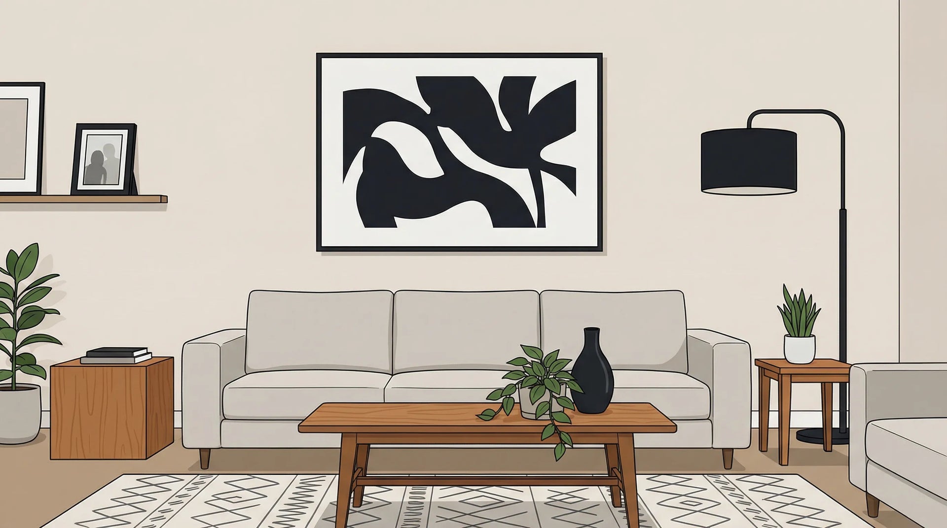
1) Minimal abstract shapes (best for modern calm)
Large areas of black with intentional negative space create instant order. This is ideal if your room already has pattern or visual noise (open shelving, mixed textiles, busy rugs).
2) Bold graphic linework (best for energy and rhythm)
Line-based black prints bring movement without introducing new colours. They also pair easily with both wood and metal finishes.
3) Black-and-white photography (best for depth and atmosphere)
Photography can anchor a space while still feeling personal. Look for strong value range (true blacks and clean highlights), not just mid-grey tones.
4) Typographic or poster-style compositions (best for “statement” rooms)
These can feel punchy and design-forward, particularly in hallways, kitchens, and home offices.
5) Figurative silhouettes (best for warmth without colour)
Silhouettes often feel emotional and human, but still graphic enough to anchor a wall.
Placement: where black art prints make the biggest impact
The same print can look “museum-level” in one location and oddly small in another. Use placement to amplify its anchoring effect.
Above the sofa or bed (the classic anchor zone)
This is where black art shines because it creates a strong, stable top line for the furniture below. If your sofa is light-coloured, a black print adds immediate contrast. If your sofa is dark, it can create a sleek monochrome block (especially with a light mount).
In the dining area (to define a zone)
If you have an open-plan space, black wall art helps visually “cap” the dining area, giving it definition without adding partitions.
In the hallway (to create direction)
Hallways benefit from contrast and clarity. A black print can turn a pass-through into a deliberate transition space.
In a home office (to sharpen focus)
Black art can make a work area feel crisp and intentional. Choose subjects that feel steady rather than chaotic if you are sensitive to visual stimulation.
Here is a quick sizing and placement cheat sheet.
| Placement | What “anchoring” looks like | Practical size guidance (general) | Framing tip |
|---|---|---|---|
| Above sofa | Print spans most of sofa width | Aim for about 2/3 to 3/4 of sofa width | A mount (mat) can add breathing room |
| Above bed | Centre the wall visually | Wider prints often feel calmer than tall ones | Keep frame finish consistent with bedside hardware |
| Dining wall | Create a focal zone | Go larger than you think, dining walls can take it | Consider glare if near pendant lights |
| Hallway | Strong read from distance | Medium to large, depending on corridor length | Black frame can look sharp, but a light frame can soften |
| Home office | Clean hierarchy behind desk | Choose a size that is legible from your chair | Matte finishes reduce screen-related reflections |
Balancing black so it feels powerful, not heavy
A common fear is that black art will “shrink” a room. In practice, it only feels heavy when the rest of the composition does not support it.
Use repetition (small doses) to make it feel intentional
If the print is your only black element, it can look accidental. Add one or two small black touchpoints elsewhere: a lamp base, a picture frame, a vase, cabinet handles, or a thin black rug detail.
Decide your contrast level: high, medium, or soft
- High contrast: black print on a white wall, with light furniture. Crisp, graphic, modern.
- Medium contrast: black print on warm white, beige, or greige. Softer, more “gallery” feeling.
- Soft contrast: black print on a dark wall (charcoal, deep green, navy). Moody and immersive.
Let negative space do the work
If you want the print to anchor without overwhelming, choose compositions with generous negative space. A lot of “breathing room” around the dark areas keeps the room feeling open.

Black art prints and colour: pairings that consistently look expensive
Black is flexible, but these pairings are especially reliable when you want a room to feel elevated.
Black + warm neutrals (timeless, calm)
Combine black art with ivory, sand, oatmeal, camel, and warm woods (oak, walnut). The warmth prevents the black from feeling harsh.
Black + earthy greens (grounded, modern)
Olive, sage, and forest tones work beautifully with black ink-like abstracts and photography. The palette feels natural and contemporary.
Black + terracotta or rust (warm, creative)
If your home has clay tones or burnt orange, black prints add sophistication and stop the palette from becoming too soft.
Black + pastels (fresh, graphic)
Powder blue, blush, and lilac gain definition with black. This is a strong approach for bedrooms and creative studios.
Black + metallics (dramatic, evening-light friendly)
Black with brass or brushed steel can look intentional and “designed”. Keep it to one metal finish if possible.
Framing choices that change the entire feel
Because black prints already bring strong contrast, framing is not just a finishing detail, it is part of the design strategy.
Black frame (sharpest, most architectural)
A black frame reinforces the anchor effect. It looks particularly clean in modern interiors, and it pairs well with monochrome palettes.
White frame or light mount (airy, gallery-like)
If you want the black to feel less heavy, introduce a white border or mount. This creates separation from the wall and makes the artwork feel curated.
Natural wood frame (softens black, adds warmth)
Wood frames are great if your space leans Scandinavian, Japandi, or generally warm. The contrast becomes more relaxed.
Consider finish in real life lighting
Prints can look different under daylight vs evening lamps. If the art sits opposite a window, a glare-prone finish may fight you. Matte finishes are often more forgiving.

One print or a set: how to decide without overthinking
You do not need a full gallery wall to get impact (and you do not need to redesign your whole room to justify one strong piece).
Choose one large print when you want immediate authority
A single oversized black print is the fastest way to anchor a room. It is also easier to keep visually calm.
Choose a pair (diptych) when you want symmetry
Pairs look excellent above beds, along corridors, or in dining spaces. They create structure, but feel less “formal” than one huge piece.
Choose a trio when the wall is long and you need rhythm
Triptychs work well in open-plan living areas, especially if the art needs to compete with multiple sightlines.
A quick “anchor test” before you buy
If you are shopping online, use this simple check to avoid prints that look great up close but disappear on the wall.
- Doorway test: Can you understand the subject from about 2 to 3 metres away?
- Value test: Does the print have true blacks (not only dark grey)?
- Breathing room test: Will you have enough blank wall around it, or will it be squeezed by shelves, switches, or tall furniture?
If you can answer “yes” to all three, the print is very likely to anchor the space successfully.
Frequently Asked Questions
Do black art prints make a room look smaller? They can if the print is undersized or the room has no other dark elements to balance it. In most cases, one well-sized black print adds depth and structure rather than shrinking the space.
What frame colour is best for black art prints? Black frames look crisp and architectural, white frames (or a mount) feel airy and gallery-like, and natural wood frames soften the contrast and add warmth.
Are black-and-white prints easier to decorate with than colour prints? Often, yes. Black-and-white works with most palettes, and you can change cushions, rugs, or accessories seasonally without the art clashing.
Where should I hang a black art print for maximum impact? Above a sofa, bed, or sideboard is the classic anchor placement because it visually “grounds” the furniture. Hallways and home offices also benefit from the clarity and contrast.
How do I stop a black print from feeling too harsh? Add a white border or mount, use a warm frame (like natural wood), and repeat small black accents elsewhere in the room so the print feels intentional.
Shop black art prints that anchor your space
If you are ready to choose a piece that brings structure, contrast, and presence to your room, browse Dreamprint’s curated collection of black art prints and pick the size and framing that best fits your space.


